Show reachability
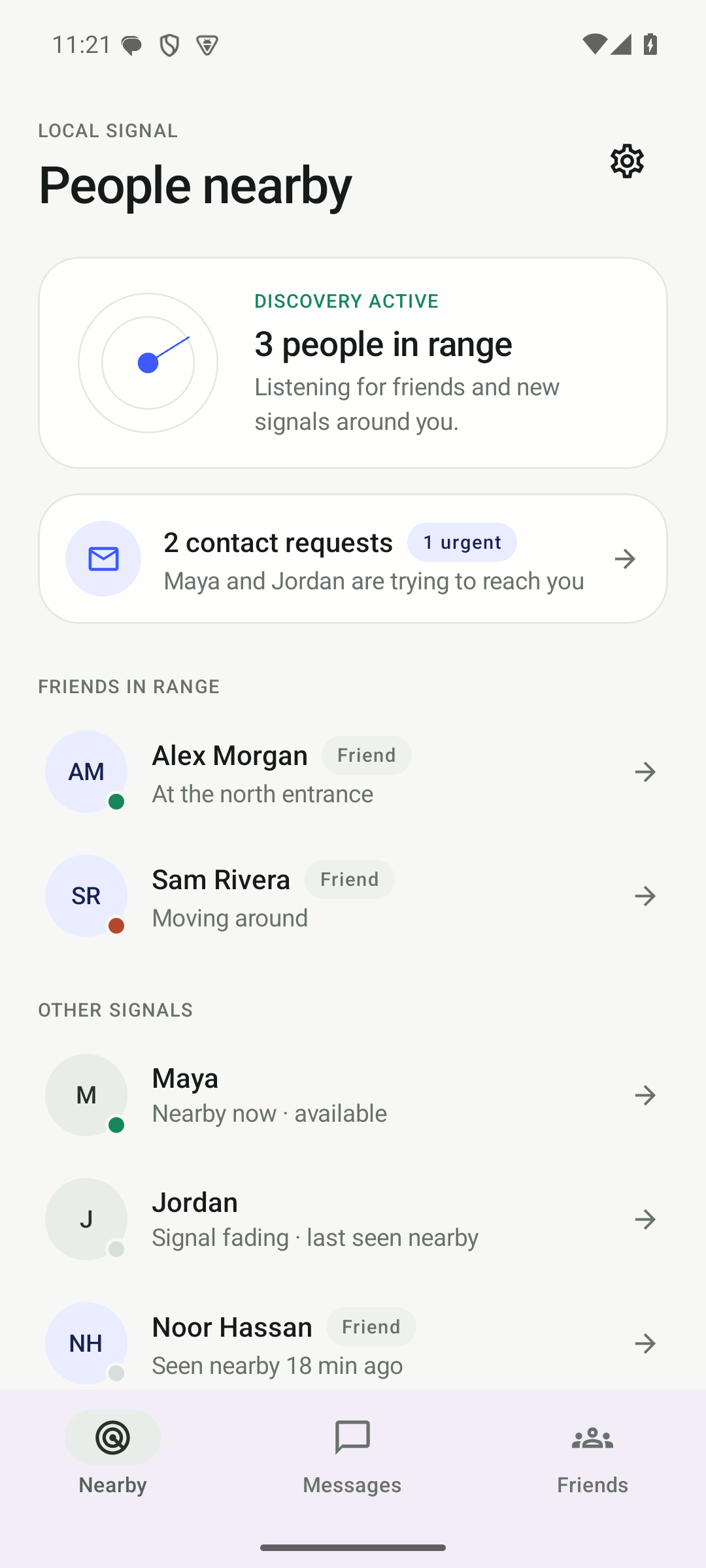
People should understand who is available, who is away, and what will happen to a message before they act.
Offgrid design system · v1.0
A calm, precise interface system for nearby communication. It should feel immediately useful in a field, festival, campsite, or crowded hall—never tactical, paranoid, or theatrical.
01 · Foundations
People should understand who is available, who is away, and what will happen to a message before they act.
Whitespace, one-pixel borders, and restrained containers create hierarchy. Shadows are rare and never decorative fog.
The radar sweep means discovery is active. Loading indicators mean work is happening. Nothing moves merely to decorate.
Range varies. Phones do not relay. Honest operational copy builds more trust than exaggerated privacy or survival claims.
02 · Color tokens
Blue identifies an action or connection, green confirms availability, and red is reserved for urgency. Most of the interface is built from paper, ink, graphite, and borders.
#F7F8F6#FEFFFD#161A18#69716D#3D5AFE#E9EDFF#16865B#DDF7EA#B5472E#D8DEDA#0E1110#151917#F3F5F3#9DA6A1#8EA2FF#27325D#55D69B#123B2C#FF896F#3A423E03 · Typography
Use the platform's clean system sans stack. Headlines are medium weight with tight tracking; body copy stays regular. Uppercase labels are small, spaced, and never used for paragraphs.
Send a signal.
No signal required.
People nearby
Automatic discovery
Message nearby friends without mobile data, internet access, or a Wi-Fi access point.
Signals show who your phone can currently reach. Range changes as people move.
Discovery active
sha256sum offgrid-v0.4.1.apk04 · Spacing & radius
Use 8–12px for compact controls, 18px for cards, 24px for large surfaces, and 30px only for prominent containers. Pills are reserved for status and compact actions.
05 · Buttons
06 · Status language
Available means the device is currently reachable.
Waiting means the item remains on this phone for retry.
Delivered means the other phone acknowledged persistence.
Urgent is user-assigned priority, not emergency certification.
Out of range is neutral and expected as people move.
07 · Components
Current release
Android 8+ · 13.0 MB
Discovery
People appear as their phones become reachable.
Phones do not relay messages for other people.
Range varies with hardware, obstacles, crowds, and radio conditions.
08 · Iconography
Icons use a 24×24 view box, round line caps and joins, and a 1.5px stroke. Filled icons are reserved for a selected navigation destination or a small state marker.
09 · Radar & motion
prefers-reduced-motion: reduce, freeze the sweep at 32° and remove breathing.Border/tone change and ≤1px lift.
3px blue outline, 3px offset.
Small circular progress indicator.
16px upward entrance, once only.
10 · Responsive behavior
Single column, 20px page gutter, compact navigation, sticky download action, 44px minimum controls.
32px gutter, two-column feature layouts, wider install steps, no forced desktop navigation density.
Two-column hero, 56px gutter, 1200px content maximum, asymmetrical grids and three-phone gallery.
clamp() between breakpoints.11 · Accessibility
Normal text reaches at least 4.5:1 and large text at least 3:1. Container colors never carry meaning without text.
Every interactive element is reachable and has a high-contrast focus ring that is not clipped by its container.
Buttons, navigation links, FAQ summaries, and icon actions are at least 44×44 CSS pixels.
Landmarks, ordered headings, lists, descriptions, buttons, links, details, and native download semantics come first.
Continuous radar and loading decoration stop or simplify when the user requests less motion.
Light and dark modes follow the operating system by default; the explicit choice is saved locally.